There is no doubt that the variety of products on store shelves is dizzying, and choosing becomes increasingly difficult. This also places a certain burden on the manufacturer, as new buyers who are not yet aware of the product most often choose the most visually interesting design. For this reason, we have made a small summary of the options for ensuring that design development is successful.
Before you even start working on visual nuances, it is definitely advisable to first understand your target audience. It’s great if you like your design, but remember that you are usually not the target audience for your product. Secondly, be sure of your company’s identity. Both the logo and the color scheme will help the buyer better associate the product with its manufacturer. And finally, the product itself. It is definitely worth considering the practical side of packaging in order to choose the most suitable one.
Visual image
Unique and memorable design. If you have had the opportunity to work with the designer to create an appropriate and interesting design for the product, then often no special effects are needed at all. And vice versa – if the visual design itself is dull, then even a gold frame cannot save it.
While it is important to be creative, make sure that the design is clear and easy to understand. Do not overload it with excessive amounts of text or images. In today’s information overload, you only have a few seconds to convey your message.
Letter spacing, font, and layout
Visible and easily readable text gives credibility to the product and does not create the impression that some information is being hidden. Be sure to check the requirements set by the country for both text and symbol sizes.
The quality of the print result is largely influenced by the layout. Use high-resolution images. If there is any doubt as to whether the image shows coffee beans or dry cat food, the design may work against you.
Color selection and printing equipment
It is largely a matter of taste, but there are practical nuances worth keeping in mind. The text should contrast sufficiently with the background color to be easily readable. For example, blue letters on a green background or very small letters on a dark background may also be “lost.” Even if the “ugly” white rectangle under the barcode does not “fit” into the design, this will be less of a problem than a situation where the scanner in a supermarket cannot read the code. And one more thing – each printing device, material, and coating affects the final result. Color differences will be very noticeable between a large-format print of a window poster, offset-printed cardboard boxes, and digitally printed stickers on wine paper, even if they are prepared from the same file. Therefore, it is definitely advisable to provide a color sample if it is necessary to maintain a very strict style.
The cherry on top
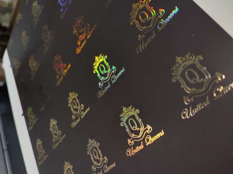
When all of the above has been taken into account, but it seems that the design still needs something extra, then it is the right moment to consider choosing an interesting material or coating, or adding some special effects – cold stamping, hot stamping, embossing, etc.
Summary
To sum up the above, it can be concluded that the two most important aspects are: preliminary research to understand who and how to do it. And finding a design artist with whom you can conjure up a vision and create the desired design. The uniqueness of the design itself has the greatest impact on the overall picture and the buyer’s feelings when evaluating the product.